Charge historically crafted bikes that were easy and fun to ride. In 2019 they decided create the ideal electric bike. We built a site to introduce their new e-bike series to the world.
Role: Design Lead — Made @ Instrument — 2019

Electrifying your ride
Charge has truly thought of everything when it comes to making a superior, affordable e-bike experience. The site refresh became an opportunity to extend their brand in new ways to help tell their story. We created new visual patterns like repurposing their logo’s iconic burst as a supporting graphic and designing a system for setting words in italics to emphasize messaging.
We also brought a little electricity into our layouts with lines in motion — undulating, zipping, and whipping across the page. These illustrate the sensation of riding an e-bike and embody the type of terrain and environment each bike is built for.


An e-bike for everyone
E-bikes make it easier to go out for a ride, bringing the freedom and enjoyment of cycling to more people than ever. Charge worked hard to make a great, affordable product engineered for specific use cases. We worked closely with our writer to use language that’s familiar, clear, and inclusive to show customers there’s a model that fits their unique lifestyle.
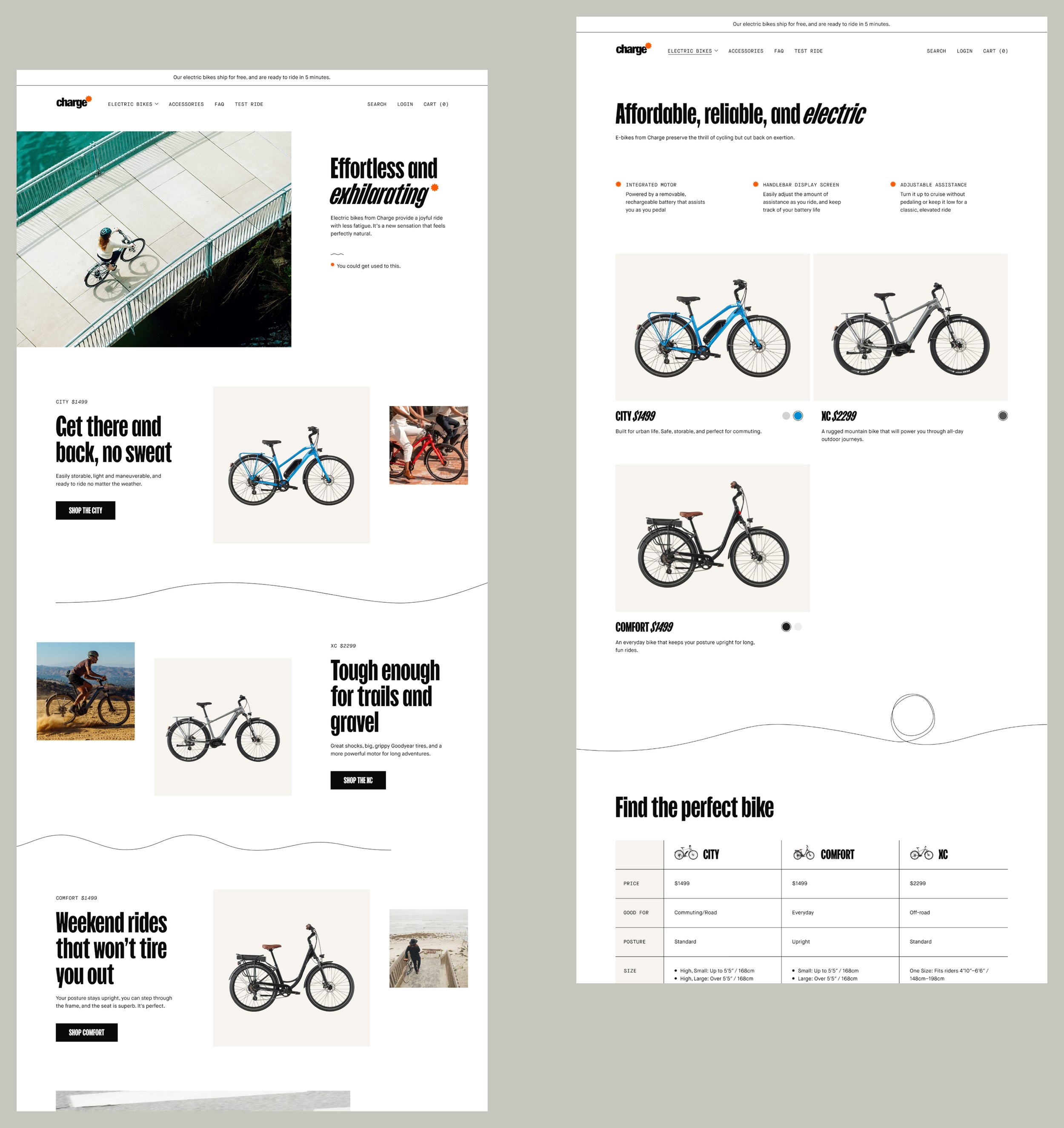

Ready to ride
Since customers typically have an entry-level of understanding of bike design and components, we prioritized showcasing user benefits over features — starting broad and diving deep as they continue their research. Once they’re ready to buy, configuring their ride is as simple as a few quick selections.


💭
As Charge’s product line continues to grow, their site is equipped to evolve with them. The reusable templates are built to scale thanks to a solid foundation of components ready to be repurposed and expanded upon.
More Projects